


Welcome to the world of data visualization! Imagine a tool that allows you to transform raw numbers into a visual masterpiece, making it easier to spot trends and patterns at a glance. Enter the strip chart – a versatile and dynamic way to showcase your data in Excel. Whether you’re a seasoned analyst or just dipping your toes into the world of data, learning how to build a strip chart in Excel can take your presentations to the next level. Let’s dive in and uncover the secrets behind creating captivating strip charts that will make your data pop!
Benefits of Using a Strip Chart in Excel
Strip charts offer a visually appealing way to display data trends over time in Excel. By using this type of chart, you can easily identify patterns and outliers within your dataset. It provides a clear visualization that helps in making informed decisions based on the information presented.
One of the key benefits of using a strip chart is its simplicity. With just a few clicks, you can create an elegant and informative chart that conveys important insights at a glance. This makes it ideal for presenting data to colleagues or stakeholders who may not be familiar with complex analytical tools.
Additionally, strip charts allow for easy comparison between different sets of data points. You can quickly spot correlations or discrepancies between variables, helping you draw meaningful conclusions from your analysis. The flexibility of customization options also enables you to tailor the chart to suit specific needs or preferences.
Step-by-Step Guide to Building a Strip Chart in Excel
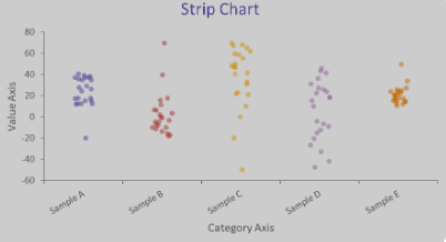
To create a strip chart in Excel, start by organizing your data. Ensure you have two columns: one for the category or time axis and another for the data points you want to visualize.
Next, select your data range and navigate to the “Insert” tab on the Excel ribbon. Choose “Scatter” from the Chart options and then select “Scatter with Straight Lines.” This will give you a basic scatter plot.
Now, right-click on any of the data points on your chart and click “Format Data Series.” In the pop-up window, adjust the line color, thickness, markers, and other visual elements to customize your strip chart according to your preferences.
You can also add labels, titles, gridlines, and other design elements to enhance the readability of your strip chart. Experiment with different formatting options until you achieve a clear and visually appealing representation of your data.
Customizing Your Strip Chart
When it comes to customizing your strip chart in Excel, the options are endless. Start by selecting your data range and inserting a basic strip chart. From there, you can tweak the colors, line styles, and markers to make your chart visually appealing. Experiment with different layouts and designs to find what works best for showcasing your data.
Don’t forget about axis labels and titles – these elements help provide context to viewers. Adjusting the scale of your axes can also help emphasize trends or patterns within your data. Additionally, consider adding trendlines or annotations to highlight important points.
Play around with formatting options like gridlines and backgrounds to enhance readability. And don’t be afraid to get creative with legends or data labels for added clarity. Remember, customizing your strip chart allows you to tailor it specifically to your audience and analytical needs.
Tips for Effectively Presenting Data with a Strip Chart
When presenting data using a strip chart in Excel, it’s essential to keep it simple and focused. Avoid cluttering your chart with unnecessary details that could confuse the viewer. Use different colors or symbols to distinguish between various data sets for clearer visualization.
Ensure that your axes are labeled clearly and include relevant information such as units of measurement. Consider adding a title to your strip chart that effectively summarizes the main takeaway from the data displayed.
Utilize annotations or callouts to highlight specific points of interest on the chart. This can help draw attention to key insights or trends within the data. Remember to adjust the scale of your axes appropriately to ensure that all data points are visible without distortion.
Experiment with different layouts and designs to find what works best for displaying your particular dataset. Don’t be afraid to customize fonts, colors, and styles to make your strip chart visually appealing while maintaining readability.
Common Mistakes to Avoid When Creating a Strip Chart
When creating a strip chart in Excel, it’s essential to avoid common mistakes that may impact the accuracy and effectiveness of your data visualization. One common error is including too much information on the chart, leading to cluttered visuals that are hard to interpret.
Another mistake to steer clear of is neglecting proper labeling of axes and data points. Without clear labels, viewers may struggle to understand the significance of the displayed data. Additionally, failing to adjust the scale properly can distort the representation of trends or patterns within the data.
It’s also crucial not to overlook color choices when designing your strip chart. Using too many colors or selecting conflicting ones can confuse rather than clarify information for your audience. Overlooking regular updates or maintenance of your strip chart can result in outdated or inaccurate insights being presented.
By avoiding these common missteps, you can ensure that your strip chart effectively communicates key findings and trends from your data analysis efforts.
Utilizing Strip Charts for Data Analysis and Visualization
Utilizing strip charts in Excel can significantly enhance your data analysis and visualization capabilities. By following the step-by-step guide provided in this tutorial, you can easily create custom strip charts tailored to your specific needs. Remember to leverage the benefits of strip charts such as highlighting patterns, trends, and anomalies in your data effectively.
Strip charts offer a clear and concise way to present information visually, making it easier for stakeholders to grasp insights at a glance. Avoid common mistakes like cluttering the chart with too much information or using inappropriate chart types that may confuse rather than clarify.
With these tips and best practices in mind, you are well-equipped to harness the power of strip charts for impactful data representation. Experiment with different customization options and continue refining your approach to maximize the value of strip charts in Excel. Happy charting!


